Using Frescobaldi with LilyPond to engrave your scores?
Frescobaldi is a very powerful program which allows you to use LilyPond with a fully featured, open source, user-friendly graphical interface. However, right out of the box it can appear to be a little tough on the eyes.
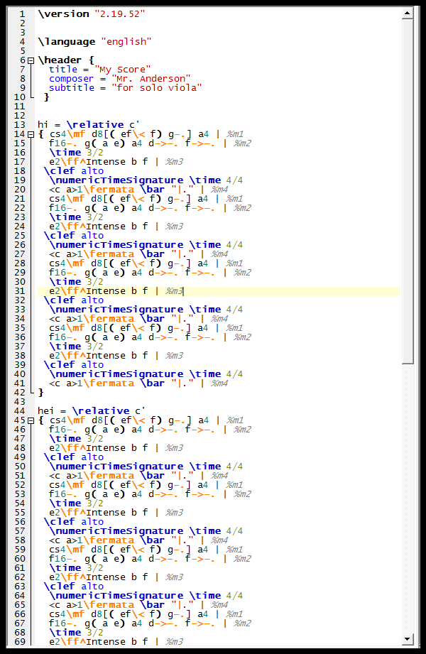
By default, Frescobaldi presents itself with a bright white background, small fonts, and plain basic colors. After a while, this may begin to strain your eyes…
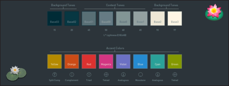
Since I spend several hours a day using Frescobaldi, I decided to create a “solarized” color scheme to help my workflow and reduce eye strain. It’s based on Ethan’s color scheme here.
This is what Frescobaldi looks like by default, before my color scheme:
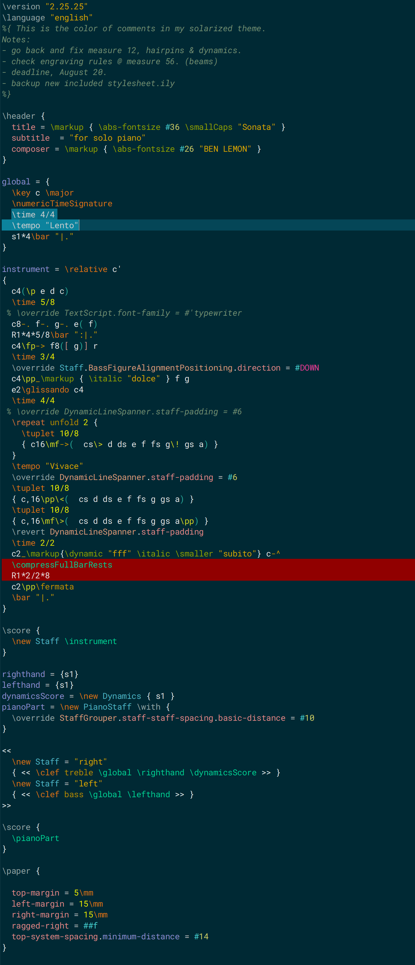
And here is what Frescobaldi looks like after my solarized color scheme:
If you would like to use my solarized color theme, it’s available as a free download here (v6.0):
bl – Frescobaldi Solarized Theme for LilyPond
My GitHub also has all of my LilyPond/Frescobaldi configurations and snippets if you’re interested in those as well.
If you would like to see more videos on LilyPond, please click here to subscribe to my channel so you don’t miss any new tutorials. Let me know if you’d like me to cover any specific topics in my next video series.
New to LilyPond? Check out Learn LilyPond! to get more information on why you should learn the program.

My solarized theme is featured in this video:
Top 3 Frescobaldi Workflow Tips